Have you ever landed on a company website and just felt like perhaps it wasn’t 100% legitimate? It’s not a good feeling, and I bet there’s no chance you’d give up your contact details or make a purchase with them!
With the majority of people searching the internet before they purchase a product or before they get in touch with a company they want to work with, it’s vital that your website conveys a feeling of trust and creditability. If you’re using Google Ads and paying each time someone lands on your website, it’s even more important!
It’s a question that businesses often ask themselves – how to get customers to trust your website?
Everyone has had the experience of clicking onto a website, only to get the feeling that it hasn’t been updated since the mid 2000’s! What do you do when you get to a site like that? Click the back button and go to the next search result that Google gave you, that’s what.
Have a think about your website – what do you think people feel when they first arrive? Do they immediately trust your company? Trust that you can deliver a good product or service? Do they feel it’s worth the investment of their time to spend ten minutes browsing through your site? Or do they get a worried feeling and decide to leave without even reading what you’ve got written on your homepage?
Ensuring your website has a feeling of credibility isn’t just about good design. Granted, that does make up a lot of it. In the same way that we all judge books by their cover (even though we know we shouldn’t), we all judge websites on that initial split-second view.
So how can you get customers to trust your website?
Make it easy to contact you
A simple way to boost your site’s credibility is by making your contact information clear: phone number, physical address, and email address.
Show that there’s a real organisation behind your site
The easiest way to do this is by listing a physical address. Other features can also help, such as posting a photo of your offices.
People love having a nose around behind the scenes, so as well as showcasing photos of your office from the outside, it’s always nice to show photos of the inside. Happy employees working away, your meeting rooms, manufacturing areas etc. It all helps to build that feeling of trust with potential customers.

A great example of a ‘Meet team’ page from Luminary.com
Show off the people behind your business
Show there are real people behind working for your company. Find a way to convey their trustworthiness through images and/or text.
For example, some sites post employee bios that include a photo and a description of their role within the company. I also love it when they add a little bit of private information – a quirky hobby, or interesting fact. Building that human connection is a great way to develop trust.
Showcase certifications and awards
Do you have experts on your team? Are your contributors or service providers authorities? Be sure to give their credentials. Are you affiliated with a respected organisation? Make that clear. Conversely, don’t link to outside sites that are not credible. Your site becomes less credible by association.
I’m Google Ad certified, and a Google Partner, and I regularly mention it and ensure I link to the official certification pages so people can check I’m not fibbing! When people come to my site looking for Google Ad management services, it definitely helps to show them my qualifications and experience.
Make the most of testimonials
Having customer testimonials and quotes is a fantastic way of building trust. They act as social proof that shows that you can, have and will deliver on the promises made regarding your products or services.
Using a third-party review provider (such as Trustpilot or Feefo) is a great way of building up a large number of verified reviews. You can host them on your own website as well, so you gain the benefit of an already trusted review site, whilst also being able to showcase them on your own site.
Design your site so it looks professional (or is appropriate for your purpose)
People quickly evaluate a site by visual design alone. When designing your site, pay attention to layout, typography, images, consistency issues, and more. Of course, not all sites gain credibility by looking like IBM.com. The visual design should match the site’s purpose.
Making sure your site is also mobile-friendly is more important than ever. So make sure people have a good user experience on all devices.
Make your site easy to use – and useful
I’m squeezing two tips into one here. Research shows that sites win credibility points by being both easy to use and useful. Some site owners forget about users when they cater to their own company’s ego or try to show the dazzling things they can do with web technology.
Think about what your visitors need to know about you and your products/services, and ensure you supply that information in an easy-to-digest way.
Update your site’s content often
People assign more credibility to sites that show they have been recently updated or reviewed. If you have a blog, make sure you post on a regular basis. If you have a news section then ensure that you have a steady stream of newsworthy updates. Likewise if your products or services expire or sell out, make sure you remove them from your site (or provide information relating to when they will come back in stock).
Use restraint with any promotional content (e.g., ads, offers)
If possible, avoid having ads on your site. If you must have ads, clearly distinguish the sponsored content from your own. Avoid pop-up ads, unless you don’t mind annoying users and losing credibility.
As for writing style, try to be clear, direct, and sincere. Don’t make any over-exaggerated claims. We’ve all been on those awful promo pages where they promise you the world… it just doesn’t feel genuine or likely, so the chances of having us hand over our bank details are slim!
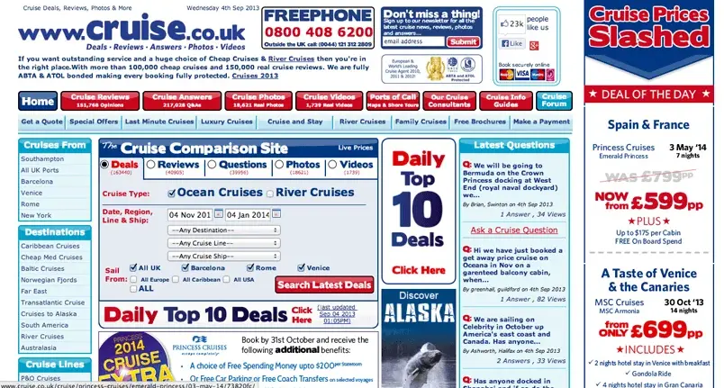
If you are running your own promotions, try to make sure there are not too many running at once. One strong promotion is more effective at converting potential customers.

An example of a landing page with too many promotions and call to actions.
Avoid errors of all types
Typographical errors and broken links hurt a site’s credibility more than most people imagine. There’s nothing more annoying that clicking on a link and ending up on a 404 page!
Make it easy to verify the accuracy of the information on your site
You can build website credibility by providing third-party support (citations, references, source material) for the information you present, especially if you link to this evidence. Even if visitors don’t click on these links, you’ve shown confidence in your material.
How does this apply to a Google Ads campaign?
If you’re directing people to your website from Google Ads then it’s even more important that customers trust your website – since you’re paying for them to land on it!
Consider creating dedicated landing pages, so that the people clicking on your ads arrive on a page that’s exactly what they were expecting. Any surprises, or making it hard to find what they are looking for will cause people to leave – wasting you money.
You must ensure you have trustworthy landing pages and a trustworthy site overall. Many people will navigate away from the Google Ads landing page onto the rest of your website. I’m sure if you have an ‘About Us’ page it’s probably a very popular page people go on once they’ve read about your products or services. It’s all part of the journey people make into deciding whether or not to give you their custom.
So please make sure your customers trust your website before embarking on any Google Ads.
- How to Do Keyword Research for Google Ads - January 15, 2024
- A Comprehensive Guide to Google Ads for B2C Businesses - January 8, 2024
- How to Write Calls to Action (CTAs) for Google Ads - December 25, 2023


