A landing page, is a page on your website that has been designed with specific visitors and goals in mind.
A landing page can be separate from your main website, and often benefits from being a stand-alone page with minimum navigation options.
It is a web page that has been designed with a single goal for a specific type of incoming visitor (be it a visitor coming from Google Ads or an email marketing campaign).
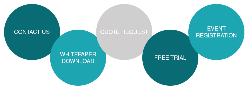
Common goals for landing pages are to get the visitor to complete a quote request or contact form, to download a document, to register for an event, or to request information relating to a product or service.
Why are landing pages important?
Not all website visitors are the same. Not all visitors will use your website in the way that you have hoped (and planned for). Different visitors have different reasons for visiting, and many have short attention spans (most of us aren’t willing to spend ages on a website, clicking about, reading all the content – we want to complete our desired needs quickly and smoothly).
A landing page allows you to define a specific user and tailor the message and content of a page to directly match their pre-determined needs as soon as they arrive.
When running online marketing campaigns, landing pages allow you to focus the web page’s message on the exact product or service you’re targeting with your campaign.
This allows for a much greater chance that the visitor will actually contact your business, than if you are directing them initially to your main homepage which may contain irrelevant information and distractions.
Effective Landing Page Design Principles
An effective landing page has extremely high levels of clarity and ease of use. It should be simple and focused on its goal.
Make sure you’re taking into consideration the below principles:
1. The headline, reinforcement, and the call to action.
Or in other words – why visitors on the page, why they should care, and how they can move forwards.
The headline should confirm to the visitor that they’ve found what they’re looking for and that your business can provide the product or service that they’re after.
It should match any messaging that has previously been used to get them there, for example using the same headline that was used in your Google Ads or email marketing campaign.
To reinforce that your business can be trusted to provide these goods or services, make use of elements that help build trust.
Good examples include:
- Listing a valid address
- Listing a telephone number
- Having a clear privacy policy
- Showcasing industry/certified logos
- Case studies
- Customer logos
- Customer quotes, and testimonials
The call to action must be clear and direct. Common phrases include things like ‘Contact Us’, ‘Request Pricing’, or ‘Sign Up’. Leave no room for ambiguity in what you want them to do or what they can expect from doing so.
2. Remove obstacles to your goal
Make it clear to the visitor which web page elements they can interact with and make sure there are no ‘dead ends’ in the design where a user is removed from the original message.
If you’re asking visitors to complete a form make sure you’re requesting the minimal amount of information necessary.
Too many people leave halfway through the shopping/enquiry process because it’s too much hassle to complete all the forms and fields. Keep the information you’re requesting from them as focused as possible and only ask for what is needed to move forward with their request.
3. Make the page beautiful and functional
The aim of your landing page is to get new leads or sales through smart web design. Smart doesn’t have to mean ugly or boring. You must captivate your visitors first.
Landing pages have to be authentic and trustworthy and not overly pushy (or spammy looking). We’ve all arrived on awful landing pages that look like long adverts, and we know from personal experience that this rarely works.
Compare your landing page approach to others in your industry and chose your design elements carefully. Limit the amount of text on the page and make sure that the visual aspects presents your information and serves your visitors well.
4. Continually test, measure and improve
Launching your landing page is by no means the last step. The only way to find out if your headline is captivating, or if your call to action is effective, is to constantly measure the results.
Once you have some data test some new ideas and measure those results. Over time you’ll be improving your landing page and increasing its effectiveness.
Get Your Google Ads Landing Pages Right with the Help of an Experienced Google Ads Agency
Are you worried about quality of your Google Ad landing pages? Are your current landing pages not performing as well as you think they should?
Learn more about our custom landing page creation service.
- How to Do Keyword Research for Google Ads - January 15, 2024
- A Comprehensive Guide to Google Ads for B2C Businesses - January 8, 2024
- How to Write Calls to Action (CTAs) for Google Ads - December 25, 2023


